The Contrast Ratio Your Checker Is Probably Reporting Wrong
WCAG contrast has five thresholds, not one. How the ratio works, why translucent text breaks checkers, and what 4.5:1 needs.
Table of contents
Paste rgba(0, 0, 0, 0.55) into most online contrast checkers and you will be told it scores 21:1 against white — a perfect pass. The text on your screen is mid-grey and scores about 4.8:1. The checker measured a colour nobody can see.
That gap is worth understanding, because insufficient contrast is the most commonly failed accessibility criterion on the web and the easiest one to fix before it ships.
Key takeaways#
- WCAG defines five thresholds, not one: 4.5:1 and 7:1 for body text, 3:1 and 4.5:1 for large text, and 3:1 for interface components.
- The ratio is computed from relative luminance, not from how different two colours look. Two colours can be wildly different hues and still fail.
- Contrast is only defined between opaque colours. Translucent text must be composited over its background first, and most checkers skip this.
- Large text means 24px regular or 18.66px bold — a size threshold, not a judgement call.
- Passing contrast is a floor, not a certificate of accessibility.
What contrast ratio does WCAG actually require?#
WCAG 2.2 sets a different bar depending on what the colour is used for. Body text needs 4.5:1 to meet level AA and 7:1 to meet AAA. Large text needs 3:1 for AA and 4.5:1 for AAA. Interface components and meaningful graphics need 3:1.
| Use | AA | AAA |
|---|---|---|
| Body text | 4.5:1 | 7:1 |
| Large text (24px, or 18.66px bold) | 3:1 | 4.5:1 |
| UI components, icons, chart series | 3:1 | not defined |
AA is the level almost every legal accessibility requirement references, so 4.5:1 is the number to design to unless you have a specific reason to go further.
The UI row is the one teams miss, because it did not exist before WCAG 2.1. Success criterion 1.4.11 Non-text Contrast covers input borders, focus rings, toggle states, icons that carry meaning, and the individual series in a chart. A form whose text passes at 7:1 and whose input borders sit at 1.6:1 still fails.
How the ratio is calculated#
Contrast ratio is (L1 + 0.05) / (L2 + 0.05), where L1 and L2 are the relative luminances of the lighter and darker colour. Relative luminance weights the three channels unequally — roughly 21% red, 72% green, 7% blue — after each channel is converted from sRGB to linear light.
Two consequences follow, and both surprise people.
Green dominates. Because green carries almost three-quarters of the luminance weight, changing the green channel moves the ratio far more than changing blue. #0000FF on white is 8.59:1; #00FF00 on white is 1.37:1. Pure blue passes AAA for body text. Pure green fails everything.
Hue is irrelevant. The formula has no term for it. Red text on a green background of matching luminance scores about 1:1 and is illegible to a large share of readers, but no contrast check will flag it — that is a different criterion (1.4.1 Use of Colour) and a different test.
Why does semi-transparent text break contrast checkers?#
Because WCAG defines contrast between two opaque colours, and a translucent colour is not one. rgba(0, 0, 0, 0.55) has no luminance of its own — what the eye receives is that black blended with whatever sits behind it, and that composite is what the standard grades.
The blend is the standard source-over rule browsers use:
result = foreground × alpha + background × (1 − alpha)Black at 55% over white gives 0 × 0.55 + 255 × 0.45, which is 114.75 per channel — about #737373. Against white that is roughly 4.8:1, so it passes AA for body text with very little room to spare. Measured unblended, it reports 21:1.
This is not an edge case. Secondary text, placeholder text, disabled states, and muted captions are almost always expressed as a translucent version of the text colour, precisely because it adapts to whatever surface it lands on. Those are exactly the styles that get shipped without checking.
Two rules make it manageable:
- Composite before measuring. Resolve the alpha against the actual background, then check the resulting hex. The colour contrast checker does this and shows you the composited value so you can verify the number yourself.
- Watch stacked translucency. A 60% foreground on a 90% surface on a page background composites twice. Each layer raises the effective luminance toward the layer beneath it.
What counts as large text?#
24px for regular weight, or 18.66px for bold and heavier. WCAG expresses these as 18pt and 14pt bold; at the CSS reference resolution one point is 1.333 pixels, which is where the odd-looking pixel values come from.
The threshold is absolute, so 1.5rem is large text at a 16px root and is not at a 14px root. Anything relying on a user-adjustable base size is checked at the size it actually renders.
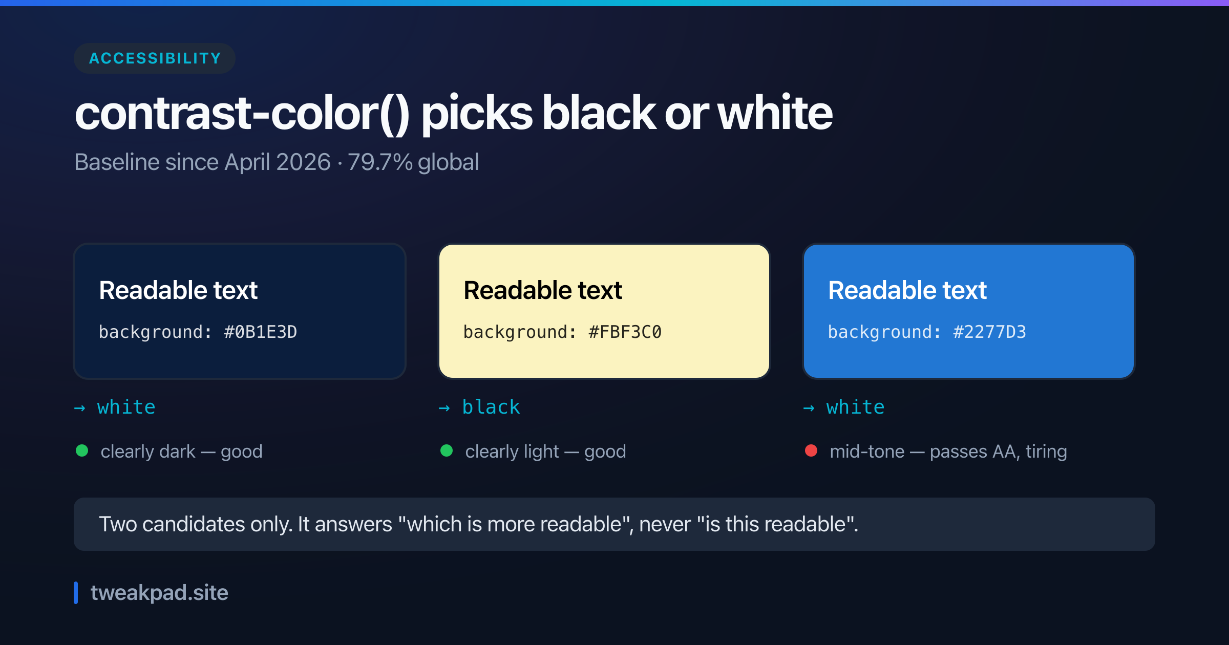
This matters mainly for headings and display type, where the 3:1 allowance opens up colours that body text cannot use. It is not a loophole for making body copy slightly bigger — 20px regular text is still held to 4.5:1.
Reading a failing result#
A ratio below your target is a design problem with a bounded set of fixes. In rough order of how much they cost:
- Darken or lighten the text until it clears the bar. Usually the smallest change, and it keeps the layout identical.
- Change the background instead, when the text colour is a brand asset you cannot move.
- Increase the size or weight to move from the 4.5:1 bar to the 3:1 one. Only legitimate if the type genuinely wants to be bigger.
- Add a backing surface — a solid card or scrim behind text sitting on an image, which is the only reliable fix for text over photography.
Should I use APCA instead?#
Not yet, if conformance is the goal. APCA is the perceptual contrast algorithm being developed for WCAG 3, and it does model readability better than the WCAG 2.x luminance ratio — particularly for light text on dark backgrounds, which the current formula treats too generously.
But WCAG 3 is a working draft, and accessibility obligations cite WCAG 2.x. Design against APCA if you like; report against 2.x, because that is what an audit will measure.
What passing does not mean#
Contrast is one success criterion out of dozens. A page can score 21:1 everywhere and still be unusable: no keyboard focus, form fields with no labels, headings used for their size rather than their level, an image carrying information its alt text omits, motion nobody can pause.
Contrast is worth checking first because it is objective, automatable, and cheap to fix while the design is still open. Treat a green result as the floor it is.
As of August 2026#
WCAG 2.2 is the current recommendation and 2.1 remains the level most regulations reference; the contrast criteria are identical in both. WCAG 3, including APCA, is still a working draft with no conformance status.
Tags
- Accessibility
- CSS
- Color
- WCAG