Your Hex Colours Are Leaving a Third of the Screen Unused
Modern displays render Display P3, but hex can only describe sRGB. How oklch() and color() reach the rest, and how to fall back safely.
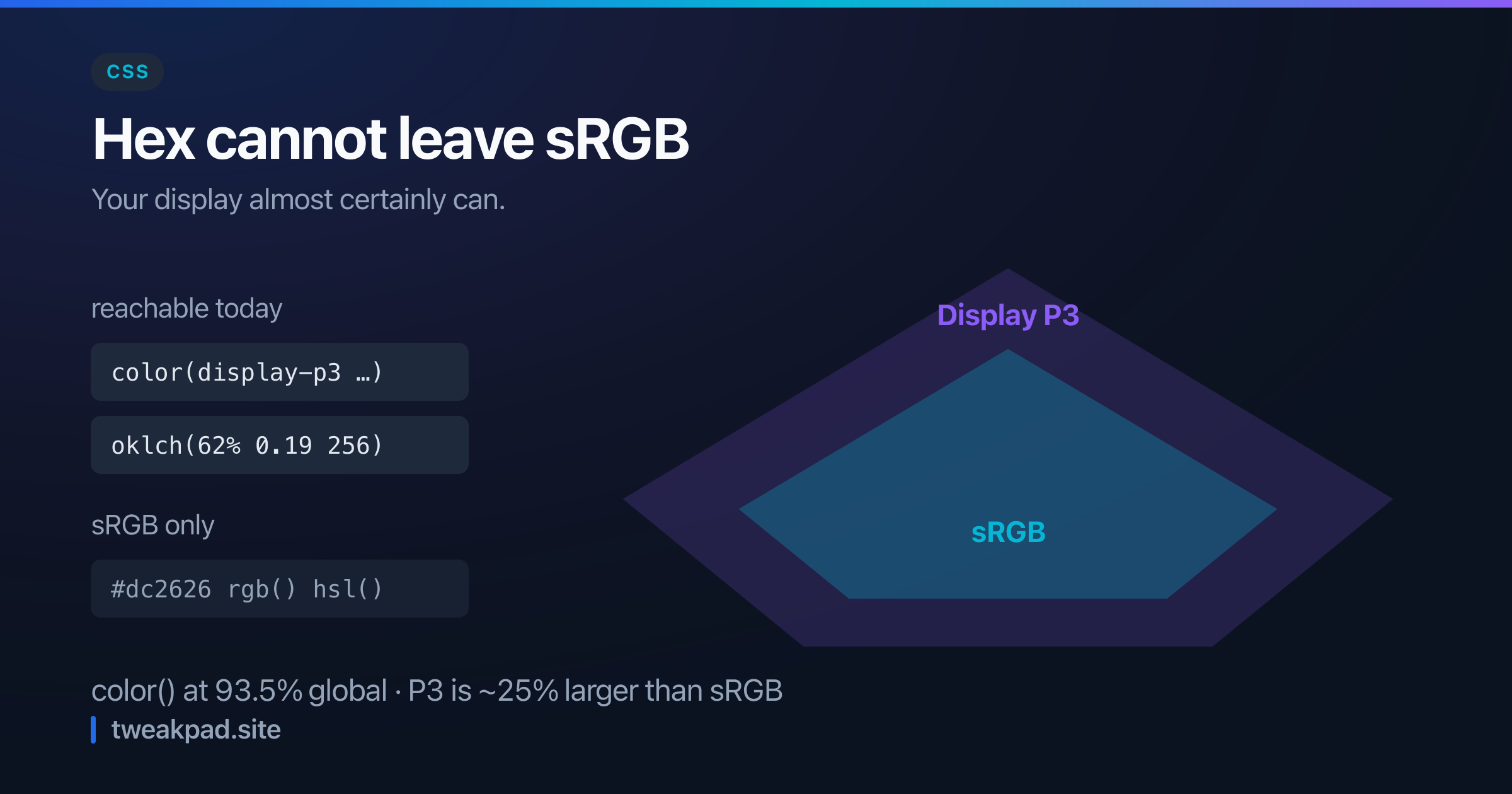
Table of contents
The phone in your pocket and almost every laptop sold in the last several years renders Display P3, a colour space roughly 25% larger than sRGB. Your stylesheet is written in hex. Hex cannot describe a colour outside sRGB, so a third of what the screen can show has never been addressable.
The CSS color() function fixes that, and it has been supported in every major browser for a while now. Global support sits at 93.5%.
Key takeaways#
- Hex,
rgb()andhsl()are all sRGB. They cannot express a P3 colour at all. color(display-p3 1 0 0)is a redder red than#ff0000, on hardware that can show it.oklch()is perceptually uniform, so equal lightness values genuinely look equally light.- Browser support is not enough. The display has to be wide-gamut too, which
@media (color-gamut: p3)detects. - Fallbacks are cheap: declare sRGB first, then override.
What is a gamut, and why does hex have one?#
A gamut is the set of colours a system can represent. sRGB was standardised in 1996 around the phosphors of a CRT monitor, and it became the web's default because every screen could manage it.
Hex is not a colour space of its own. #ff0000 means "the most red this space can do", and the space is sRGB by definition. So when a P3 display renders #ff0000, it shows you sRGB's red, not the redder one it is capable of. The extra range sits idle.
That was the correct trade for a long time. It stopped being correct once wide-gamut screens became ordinary rather than professional equipment.
How do I actually use the wider range?#
Two functions, doing different jobs.
color() addresses a named space directly:
.alert {
  background: #dc2626; /* sRGB fallback */
  background: color(display-p3 0.86 0.15 0.15);
}
Browsers that do not understand the second declaration keep the first. That is the whole fallback mechanism, and it needs no @supports.
oklch() is the one to build a palette in:
:root {
  --brand: oklch(62% 0.19 256);
  --brand-hover: oklch(55% 0.19 256);
}
Three values: lightness, chroma, hue. It can also express colours beyond sRGB, so it reaches into P3 without you naming a space at all.
Why not just keep using HSL?#
Because HSL lightness is a geometric artefact rather than a measurement of how bright a colour looks.
Set yellow and blue to the same HSL lightness and the yellow appears far brighter. Build a palette by holding lightness constant and rotating the hue, and you get a set of colours with visibly uneven weight. Every designer who has done this has then hand-corrected each swatch, which is the step OKLCH removes.
OKLCH is derived from the Oklab perceptual model, so oklch(60% 0.15 20) and oklch(60% 0.15 250) genuinely read as equally light. Generating a consistent ramp becomes arithmetic:
| Role | Value |
|---|---|
| 50 | oklch(97% 0.02 256) |
| 500 | oklch(62% 0.19 256) |
| 900 | oklch(30% 0.12 256) |
Hold hue, vary lightness, taper chroma at the extremes. That is a design system in three lines, and it stays even because the numbers mean something.
Browser support is not the whole story#
This is the part that catches people out. A browser can parse color(display-p3 …) on a screen that cannot display it, in which case it clamps to the nearest sRGB colour and you see no difference.
So the feature query you want is about the hardware:
.hero {
  background: #0ea5e9;
}

@media (color-gamut: p3) {
  .hero {
    background: color(display-p3 0.05 0.65 0.91);
  }
}
That checks the display rather than the parser. Useful when the wide-gamut version is a deliberate design choice rather than a slightly better default.
For most work you do not need it. The progressive-enhancement pattern of two background declarations handles both cases with less code, and the browser picks correctly.
Where the wider gamut actually earns its keep#
Be honest about the payoff: on body text and neutral greys, nobody will notice. The difference shows up in saturated colour.
Brand accents, gradients, data visualisation series, and product photography all gain visibly. A saturated cyan or magenta in P3 is noticeably more vivid than its sRGB clamp, and a gradient between two wide-gamut stops has fewer bands because there is more room between them.
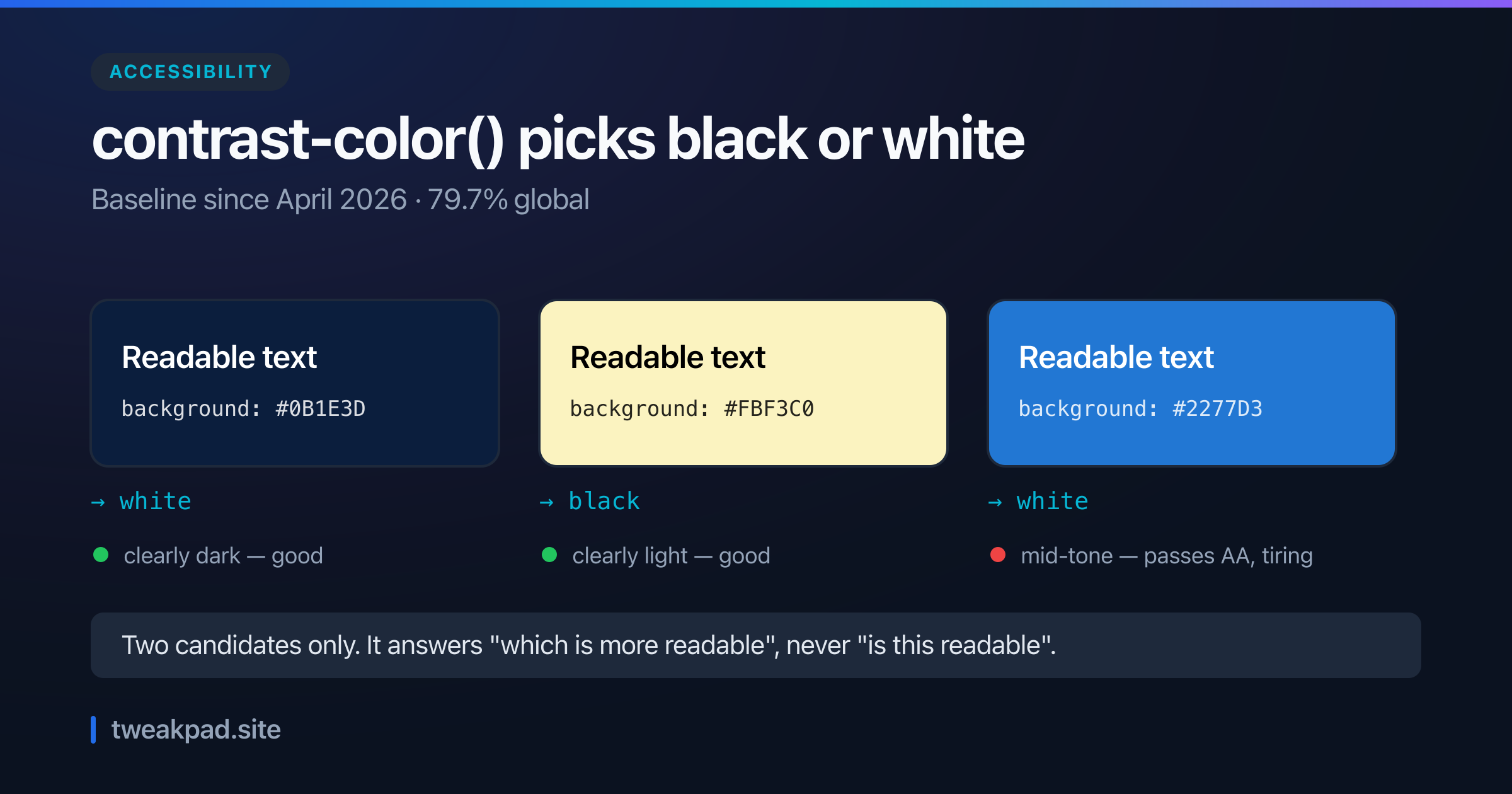
There is a real caution with accessibility. Contrast ratios are computed on relative luminance, and a P3 colour and its sRGB fallback do not have identical luminance. A pair that passes in one may fail in the other, so check both rather than assuming the fallback inherits the result. The colour contrast checker measures the pair you actually give it, and the colour converter moves a value between hex, RGB, HSL and OKLCH so you can compare the two forms directly.
A migration that will not break anything#
- Keep every existing hex value. They are your fallbacks and they cost one line each.
- Convert your palette tokens to
oklch(). This alone fixes uneven lightness, before any gamut question. - Add
color(display-p3 …)overrides for accent colours only, where saturation matters. - Re-check contrast on both versions of any pair used for text.
- Leave neutrals in sRGB. There is no wide-gamut grey worth having.
Step 2 is where most of the value is. Perceptual uniformity improves a palette on every screen ever made; the extra gamut only improves it on good ones.
The short version#
Hex is an sRGB-only notation on hardware that outgrew sRGB. color() reaches the rest at 93.5% support, and oklch() fixes the older and more annoying problem of lightness that does not match perception. Declare sRGB first and override, check the display with color-gamut when it matters, and re-test contrast on both.
Sources: MDN: color(), Can I use: color()
Tags
- CSS
- Color
- Oklch
- Design Systems