CSS contrast-color() Is Baseline. It Only Ever Answers Black or White
It picks readable text against any background automatically. But it has exactly two answers, and on mid-tones neither is comfortable.
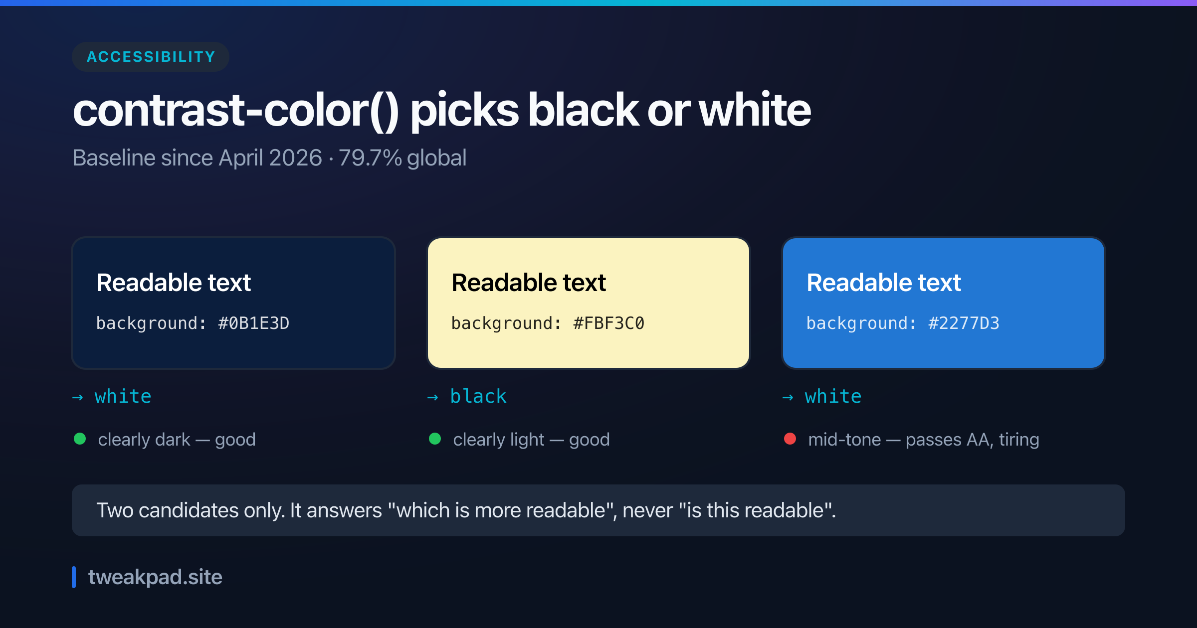
Table of contents
Pick a background colour, then pick text that reads against it. Do that for a theme with user-configurable colours and you are writing luminance maths in JavaScript, or shipping two hardcoded palettes and hoping.
contrast-color() moves that decision into CSS. It became Baseline in April 2026 and sits at 79.7% global support. It is also narrower than the name suggests, in a way worth knowing before you rely on it.
Key takeaways#
- It returns only
whiteorblack. Never a tinted or brand-adjacent colour. - Whichever of the two has greater contrast wins. On an exact tie you get white.
- The target is WCAG AA, the 4.5:1 threshold for normal text.
- Mid-tone backgrounds are the weak spot: it will return an answer that passes and still reads poorly.
- Chrome and Edge from 147, Firefox 146, Safari 26.
What it replaces#
The problem it solves is real and annoying. A theme where the user picks an accent colour, a chart with generated series colours, a CMS where an editor sets a section background — in every case you know the background at runtime and not before.
The old answers were all unsatisfying. Compute relative luminance in JavaScript and set a custom property. Ship a light/dark flag alongside every colour and trust whoever fills it in. Or pick one text colour and accept that it fails against half the range.
The CSS version is one declaration:
:root {
  --accent: lightblue;
}

button {
  background-color: var(--accent);
  color: contrast-color(var(--accent));
}
Change --accent to anything and the text follows. No script, no build step, no second variable to keep in sync.
Two answers, not a spectrum#
This is the part the name obscures. contrast-color() does not compute an optimal contrasting colour. It evaluates exactly two candidates, white and black, and returns whichever contrasts more with the input.
That constraint is deliberate rather than an early-version limitation. Returning an arbitrary colour would mean the browser inventing a hue, which is a design decision no engine should make on your behalf. Black and white are the two choices that are always defensible.
There is a tie-break rule worth knowing, because it is the one case where the answer is arbitrary. When both candidates contrast equally with the background, the function returns white. That happens near the midpoint of the lightness range, which is also where the result is least likely to be comfortable, so a page rendering white text you did not expect is a useful signal about the background rather than a bug.
The consequence is that contrast-color() answers "which of these two is more readable", not "is this readable". Those come apart in the middle of the lightness range.
The mid-tone problem#
Take a background like #2277d3, a fairly ordinary royal blue. White text against it clears 4.5:1, so the function returns white and the pair technically passes AA.
Read a paragraph of it and it is tiring. AA is a floor for a machine-checkable property, not a judgement about comfort, and mid-tone backgrounds are exactly where the two diverge. The same is true in reverse for a mid-tone that black barely clears.
So the rule of thumb: contrast-color() is excellent on colours that are clearly light or clearly dark, and it is a warning sign on anything in the middle. If your palette has a lot of mid-tones, the function will not save them; it will only tell you which of two mediocre options is less bad.
The check worth doing is on the background, before you get to the text. Push accent colours toward the ends of the lightness range and the automatic answer becomes a good one. The colour contrast checker gives you the actual ratio for a pair, and the colour picker shows a candidate against both black and white at once, which is the quickest way to spot a mid-tone that neither suits.
Falling back on the other 20%#
An unsupported browser drops the whole declaration, so give it something first:
button {
  background-color: var(--accent);
  color: #000;
  color: contrast-color(var(--accent));
}
Two declarations of the same property, oldest first. No feature query needed, because a browser that cannot parse the second keeps the first.
Choose that fallback deliberately. It applies to every background in the unsupported case, so pick whichever of black or white works across the range your accent colour can actually take. If the range genuinely spans both ends, this is a case for @supports and a more conservative default:
@supports not (color: contrast-color(red)) {
  button {
    background-color: var(--accent-safe-dark);
    color: #fff;
  }
}
Constrain the background rather than guessing the text, since one of those you control.
Where it fits, and where it does not#
Good fits: user-themable accents, generated chart series, tag and category chips coloured from a hash, CMS-authored section backgrounds, syntax-highlight themes.
Poor fits: body text, where you should be choosing both colours deliberately; brand pairings that a designer already specified; anything where the answer needs to be a tint of the background rather than a neutral.
One more limit worth stating plainly. contrast-color() targets AA for normal text. It does not know your font size or weight, so it cannot apply the large-text threshold of 3:1 or aim at AAA. A 12px light-weight label on a background it approves of can still be hard work, because contrast ratio was never the whole of legibility.
The short version#
contrast-color() removes a genuine class of runtime colour maths, in one declaration, at 79.7% support with a trivial fallback. Just be clear about what it does: it chooses between black and white, it targets the AA floor, and on mid-tone backgrounds it will hand you a passing answer that is still uncomfortable to read. Fix the background, and the text takes care of itself.
Tags
- CSS
- Accessibility
- Color
- Baseline