Web Accessibility: A Checklist You Can Actually Finish
The issues behind most real accessibility failures — contrast, keyboard access, labels, focus — with concrete checks.
Table of contents
- 1. Colour contrast
- 2. Everything must work from the keyboard
- 3. Every control has an accessible name
- 4. A skip link
- 5. Respect motion preferences
- 6. Do not convey meaning by colour alone
- 7. Announce dynamic changes
- 8. Allow zoom
- Testing, in order of value
- Frequently asked questions
- Is a Lighthouse accessibility score of 100 enough?
- Do I need to support screen readers if my users do not use them?
- Is ARIA needed for a simple site?
- What is the single highest-impact fix?
- Related reading
- References
Accessibility audits find the same handful of problems over and over. Fixing these covers the large majority of real-world barriers.
1. Colour contrast#
WCAG AA requires:
- 4.5:1 for normal text
- 3:1 for large text (18pt, or 14pt bold) and for UI components and graphics
This is the most commonly failed criterion, and it is invisible to anyone with good eyesight on a good screen — which is why it must be computed, not eyeballed.
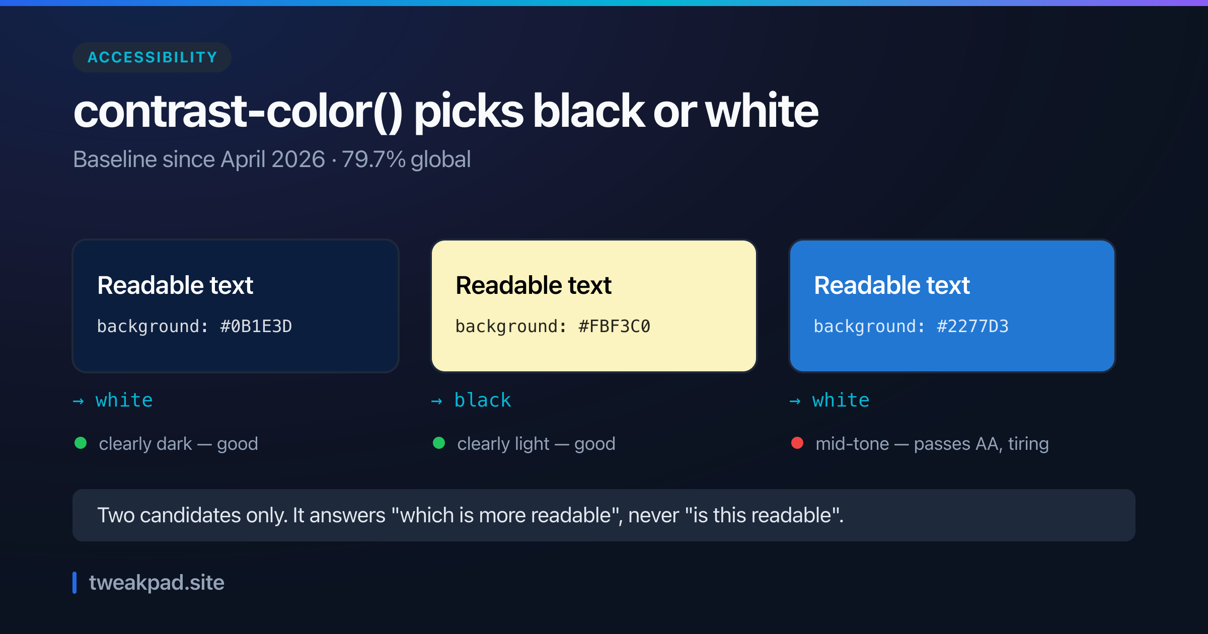
A trap worth knowing: light-looking brand colours often fail against white text. #06B6D4 (cyan) against white is 2.43:1 — a clear fail. Against near-black it is 8.65:1, comfortably AAA. So a palette needs a foreground pair per colour, not one universal text colour.
--brand-accent: #06b6d4;
--brand-accent-foreground: #062c33; /* dark, because the accent is light */
Check any pair with the Color Converter, which reports contrast against both white and black.
2. Everything must work from the keyboard#
Tab through your entire page. Every interactive element must be reachable, operable and visibly focused.
Common failures:
<div onclick>. Not focusable, not operable by keyboard. Use<button>.outline: nonewith no replacement. This removes the only indication of where focus is.- A modal that does not trap focus. Tab escapes behind the overlay.
- A custom dropdown with no arrow-key support.
For focus styling, use :focus-visible — it shows the ring for keyboard users and not for mouse clicks, which is the behaviour designers usually want:
:focus-visible {
  outline: 2px solid var(--ring);
  outline-offset: 2px;
}
Never remove focus styles without providing an alternative that is at least as visible.
3. Every control has an accessible name#
<!-- Icon-only button: the icon is not a name -->
<button aria-label="Close dialog">
  <XIcon aria-hidden="true" />
</button>

<!-- Input -->
<label for="q">Search</label>
<input id="q" name="q" />

<!-- Image: alt describes purpose, or is empty if decorative -->
<img src="chart.png" alt="Revenue rose 40% between January and June" />
<img src="divider.png" alt="" />
Two details: aria-hidden="true" on the icon prevents it being announced twice, and alt="" is correct for decorative images — omitting alt makes some screen readers read the filename instead.
4. A skip link#
The first focusable element on the page should let a keyboard user jump past the navigation:
<a href="#main-content" class="sr-only-focusable">Skip to main content</a>It can be visually hidden until focused. Without it, every keyboard user tabs through the whole header on every page.
5. Respect motion preferences#
@media (prefers-reduced-motion: reduce) {
  *,
  *::before,
  *::after {
    animation-duration: 0.01ms !important;
    transition-duration: 0.01ms !important;
    scroll-behavior: auto !important;
  }
}
Vestibular disorders make large-motion animations genuinely nauseating. This is a few lines and it is not optional.
6. Do not convey meaning by colour alone#
A red border on an invalid field is invisible to a colour-blind user. Pair it with text and aria-invalid:
<input aria-invalid="true" aria-describedby="email-error" />
<p id="email-error" role="alert">Enter a valid email address.</p>
The same applies to an active nav item: aria-current="page" conveys the state that colour alone does not.
7. Announce dynamic changes#
Content that appears after an action must be announced:
<!-- Non-urgent: announced when the user is idle -->
<div role="status" aria-live="polite">3 results found</div>

<!-- Urgent: interrupts -->
<div role="alert">Could not save your changes</div>
Toast notifications, form results and search counts all need this or they are silent for screen-reader users.
8. Allow zoom#
<!-- Correct -->
<meta name="viewport" content="width=device-width, initial-scale=1" />

<!-- Never do this -->
<meta name="viewport" content="width=device-width, maximum-scale=1, user-scalable=no" />
Blocking pinch-to-zoom is a WCAG failure and affects a very large number of users.
Testing, in order of value#
- Keyboard only. Unplug the mouse and use the site. Catches more than any tool.
- A screen reader. VoiceOver (Cmd+F5 on macOS) or NVDA. Twenty minutes here is revealing.
- Automated tools. axe DevTools or Lighthouse. Fast, but they catch roughly 30% of issues — mostly contrast and missing attributes.
- 200% zoom. Reveals fixed heights and overflow bugs.
The order matters: automated tools are the least thorough and the most tempting to stop at.
Frequently asked questions#
Is a Lighthouse accessibility score of 100 enough?#
No. It means no detectable issues. A page can score 100 and be unusable by keyboard.
Do I need to support screen readers if my users do not use them?#
You do not know whether they do, and accessibility overlaps heavily with general usability — keyboard support, clear labels and good contrast help everyone. In many jurisdictions it is also a legal requirement.
Is ARIA needed for a simple site?#
Rarely. Native HTML elements carry the right semantics already; ARIA is for filling gaps in custom widgets. Incorrect ARIA is worse than none.
What is the single highest-impact fix?#
Keyboard operability with a visible focus indicator. It is the barrier that makes a site completely unusable rather than merely awkward.
Related reading#
- Semantic HTML
- CSS Custom Properties — how to encode accessible colour pairs
References#
Tags
- Accessibility
- HTML
- CSS
- Best Practices